Case Studies
Follow Along
A small illustration from a larger projects around the history of cannabis in Texas.
.
.
.
.
.
#dispensary #hemp #flowerpower #branding #illustration #Mesoamerican #featheredserpent #Chinesedragon #Quetzalcoatl #Aztec #azuredragon #texasgirl #texas

Sometimes our projects aren’t full brand identities, or websites but they’re opportunities to extend brands in unique ways.
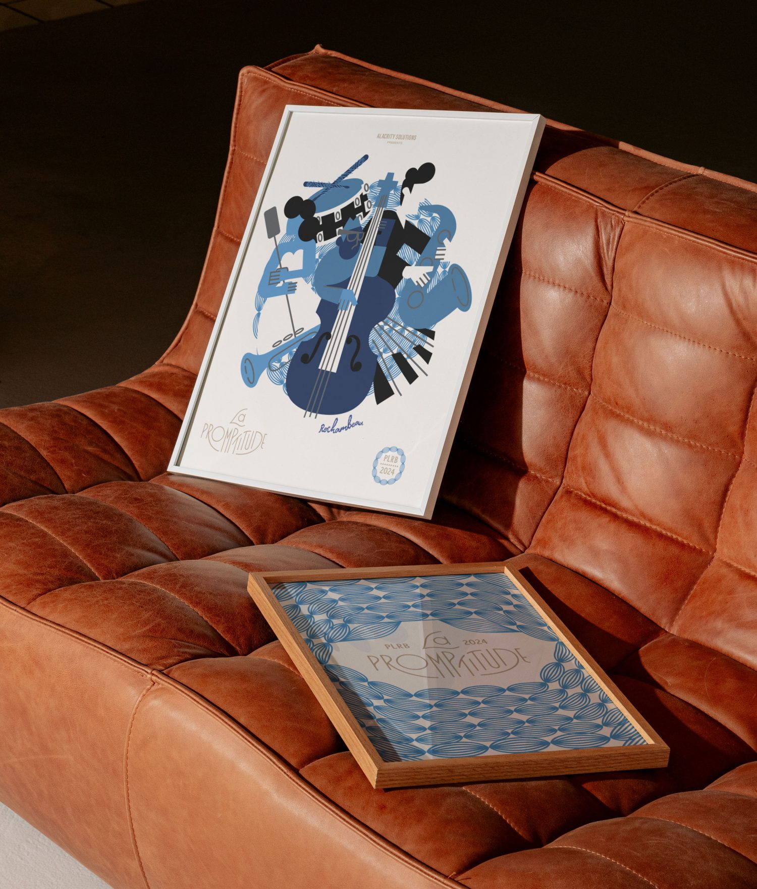
I had the chance to help Alcorn Agency, bring Alacrity Solutions event, La Promptitude to life. The event took place at @rochambeaubos in Boston, Massachusetts, and embodied all things French. To learn more, visit the case study link in bio and to help bring life to your event, let’s chat!

There’s nothing better than collaboration. A while back, my new friend @jimkennelly639 brought me on to collaborate for a new coffee shop called: silver cup coffee in Hilton Head, SC. Jim provided incredible brand strategy and pulled me in to work on a concept that tied the resort aesthetic with a familiar, unpretentious staple of every day life: coffee. We aimed to define a look the look that provided nostalgia and immediately felt fresh. Thanks again Jim!

Decrem Films is the production company from award-winning Dallas filmmaker: Merced Elizondo. Decrem represents the banner of quality across the filmography and filmmakers that choose to bring their films to the company. The brand identity speaks to the sensibility for the slice of life approach to the creations and the balanced tone of emotional complexity and relatability.
We’ve create a dynamic narrative that serves as an invisible thread through the brand using fragments of the logo that become building blocks or abstract characters describing a compelling story.
Event photography by: @carlosrodriguuezz
Special thanks to: @andrewczap for the referral and @mercedelizondo for the trust
Edited using @adobe Premiere
#brandidentity #identitydesign #branding #logo #typography #filmmaker #dallasfilm #lafilmmaker #lalaland #la #artdirection

I wanted to share a Chimera logo for a cannabis brand that didn`t make the cut. A chimera is plant composed of 2 or more genetically distinct tissues, so we leaned into the mythology of a perfect creature to nod to the brand`s precision in growth.
.
.
.
.
.
#Logoawesome #instalogo #trend #illustrato #logoinspiration #icondesign #brandlogo #logo #logodesigner #brand #icon #flower #dispensary #sativa #indica

From Label to Lager: 🍺✨ What started as a label design project evolved into a full Oktoberfest beer packaging extravaganza! 📸🍁 Sometimes you have to make your own opportunities. [caption and background edits made with ai]
.
.
.
.
#BrandDesigner #ContentCreator #Oktoberfest #design #designer #illustration #dribbble #packaging #packagingdesign #moody #germany
![From Label to Lager: 🍺✨ What started as a label design project evolved into a full Oktoberfest beer packaging extravaganza! 📸🍁 Sometimes you have to make your own opportunities. [caption and background edits made with ai]
.
.
.
.
#BrandDesigner #ContentCreator #Oktoberfest #design #designer #illustration #dribbble #packaging #packagingdesign #moody #germany](https://brokenstraw.co/wp-content/plugins/instagram-feed-pro/img/placeholder.png)
It’s finally time for #Oktoberfest. Here’s a little six pack cover I made for Hop and Sting’s Rheinhart Festbier. Prost! Special thanks to @sirmon for asking me to work on this.

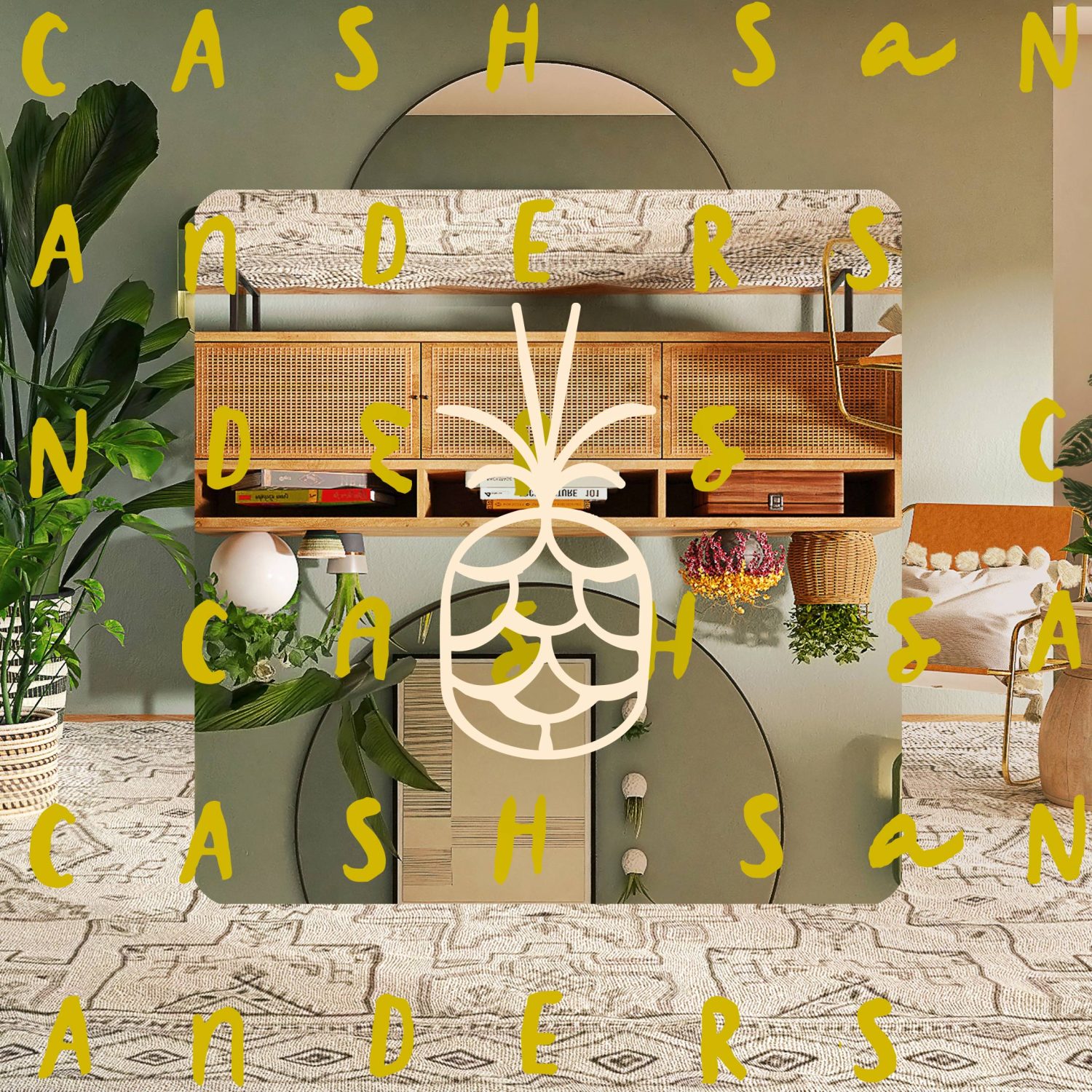
Recently we were engaged by our long time friend and business partner to help develop the visual identity for her new business: Cash Sanders Home Decor.
The brand is centered on providing energy and diversity to the “ready made” home decor of today. To lean more about our approach, check out the link in bio.
📸 by unsplash
#decor #branding #visualidentity #design #designer #graphicdesign #packaging #logodesigner #logo

So excited to share this little sample of a project we recently wrapped for Cash Sanders Home.
This little illustration is about the possibilities of how home decor can change a room. I’m so proud of my friend, colleague, confidant, business partner and client @sasaestes for taking this leap.
Full Case Study coming soon.

Another brand element that I was so happy to contribute to my friends at @mallardagency. Congrats on the brand launch!

Come learn how to step up your web design game! There’s still time to buy tickets for my workshop at @circlesconf. Thanks so much for the opportunity!

One of my favorite icons I’ve created in a while for some friends who are rebranding. This mark didn’t make the cut, but I was very happy with how it came out: playful, sophisticated, with a bird reference and storytelling reference.


